Cardon Webb
Designer
0
/
100
Cardon Webb | Designer
Work
Projects
About
Collections
Work
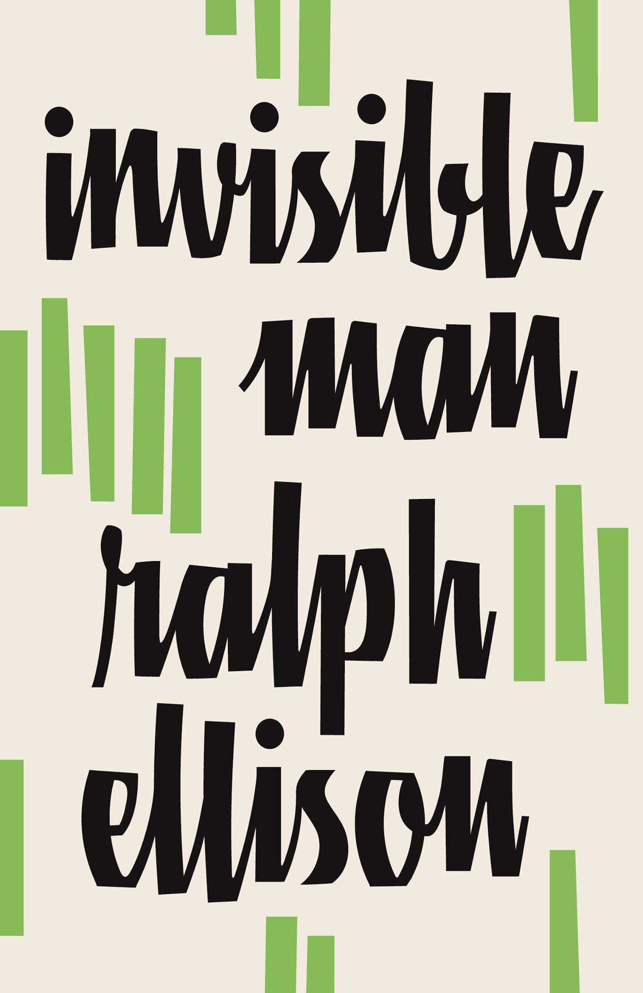
Ralph Ellison series
Sep, 2012
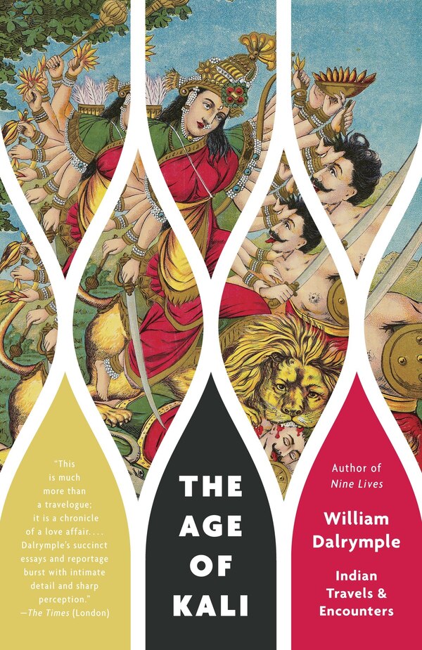
Dalrymple series
Jun, 2012
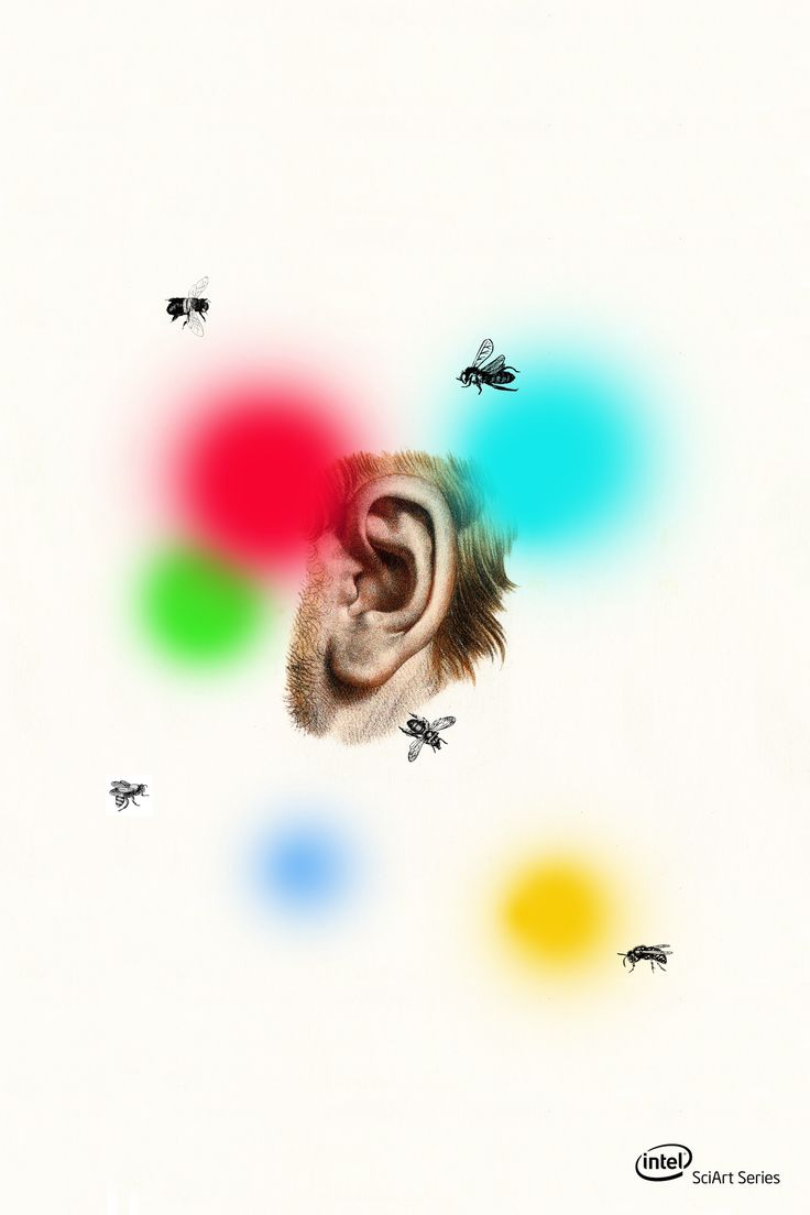
Intel SciArt
Jun, 2012
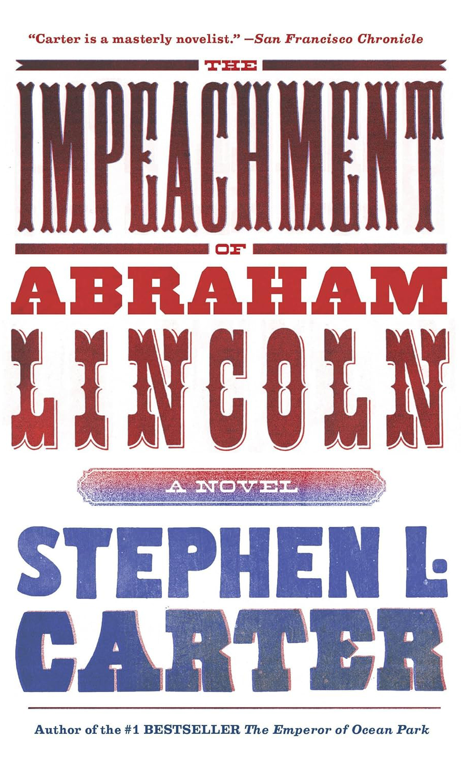
The Impeachment of Abraham Lincoln
Feb, 2012
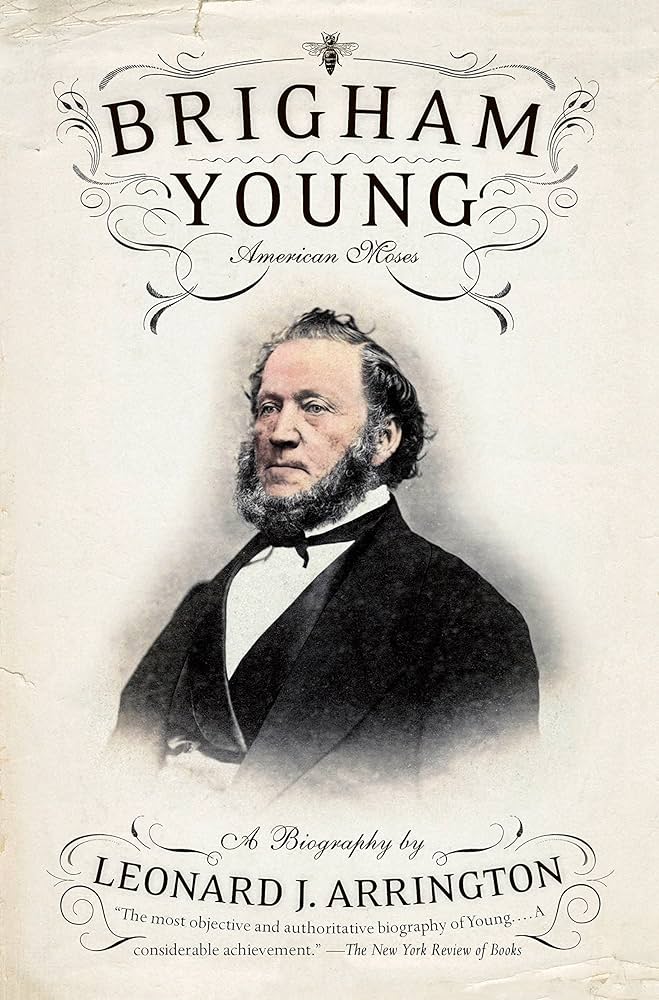
Brigham Young
Mar, 2012
Persistence of the Color Line
Nov, 2011
An Anatomy of Addiction
Nov, 2011
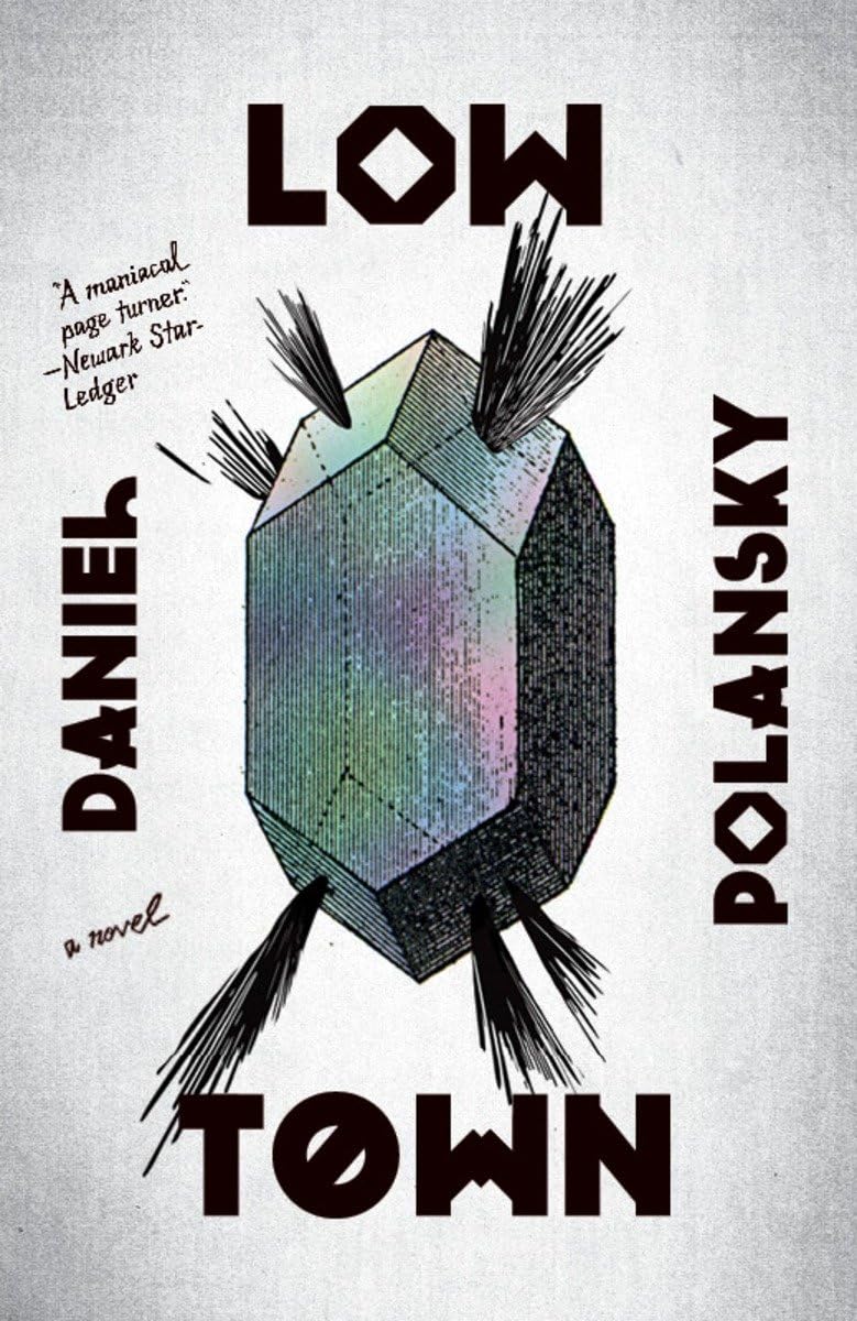
Low Town
Oct, 2011
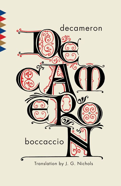
Decameron
Sep, 2011
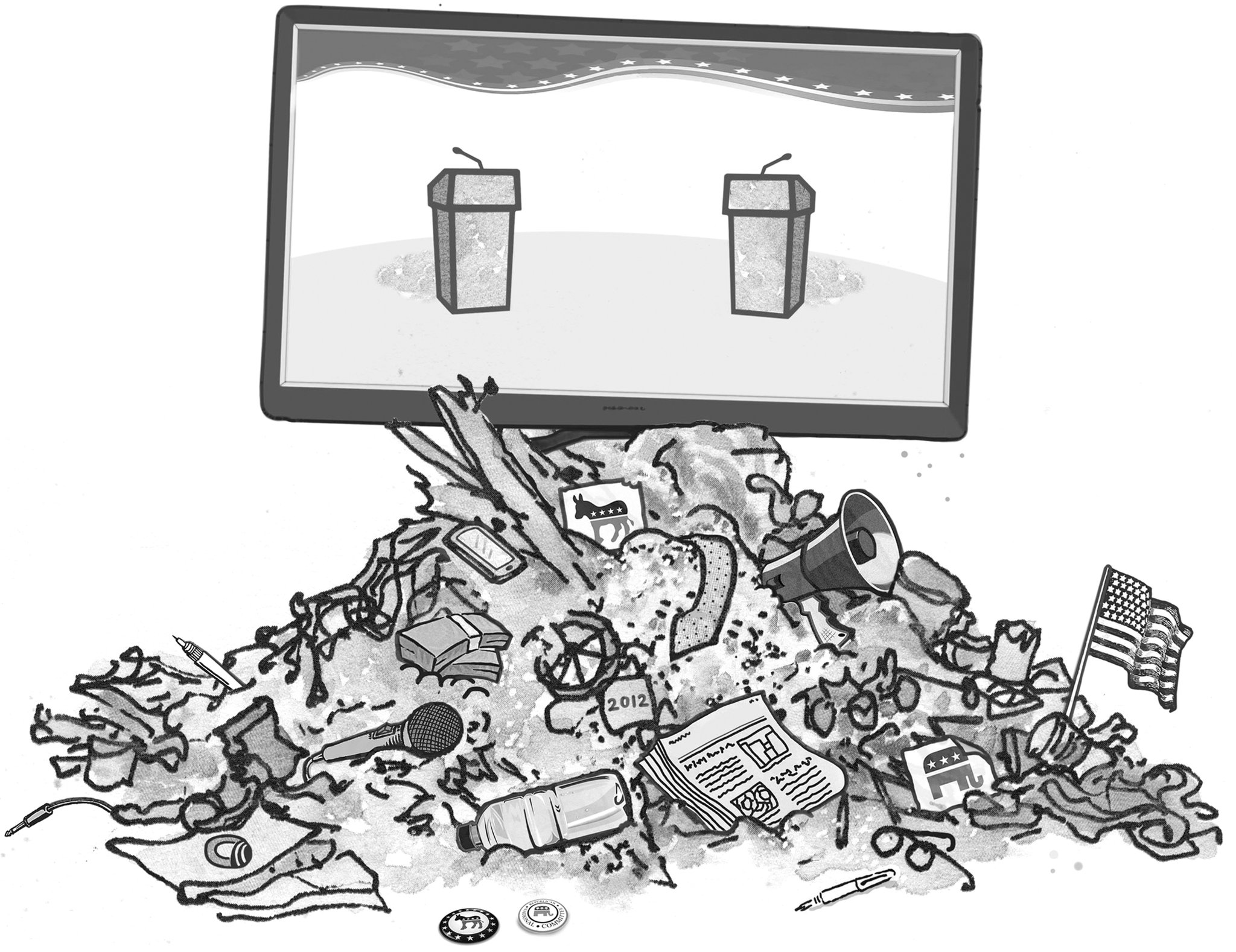
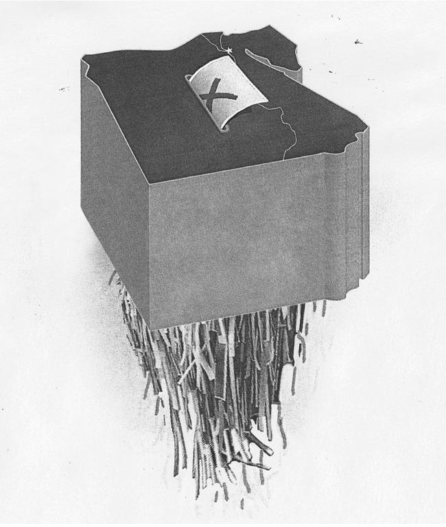
Op-Ed Illustration
Oct, 2012
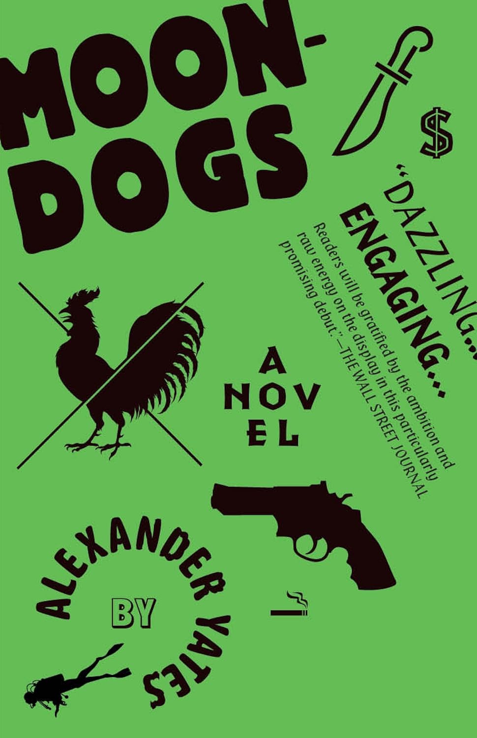
Moondogs
Aug, 2011
Wicked River
Aug, 2011
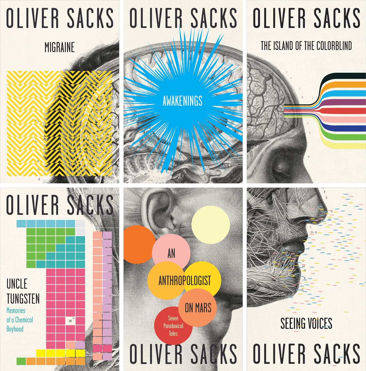
Oliver Sacks Series
Jun, 2011
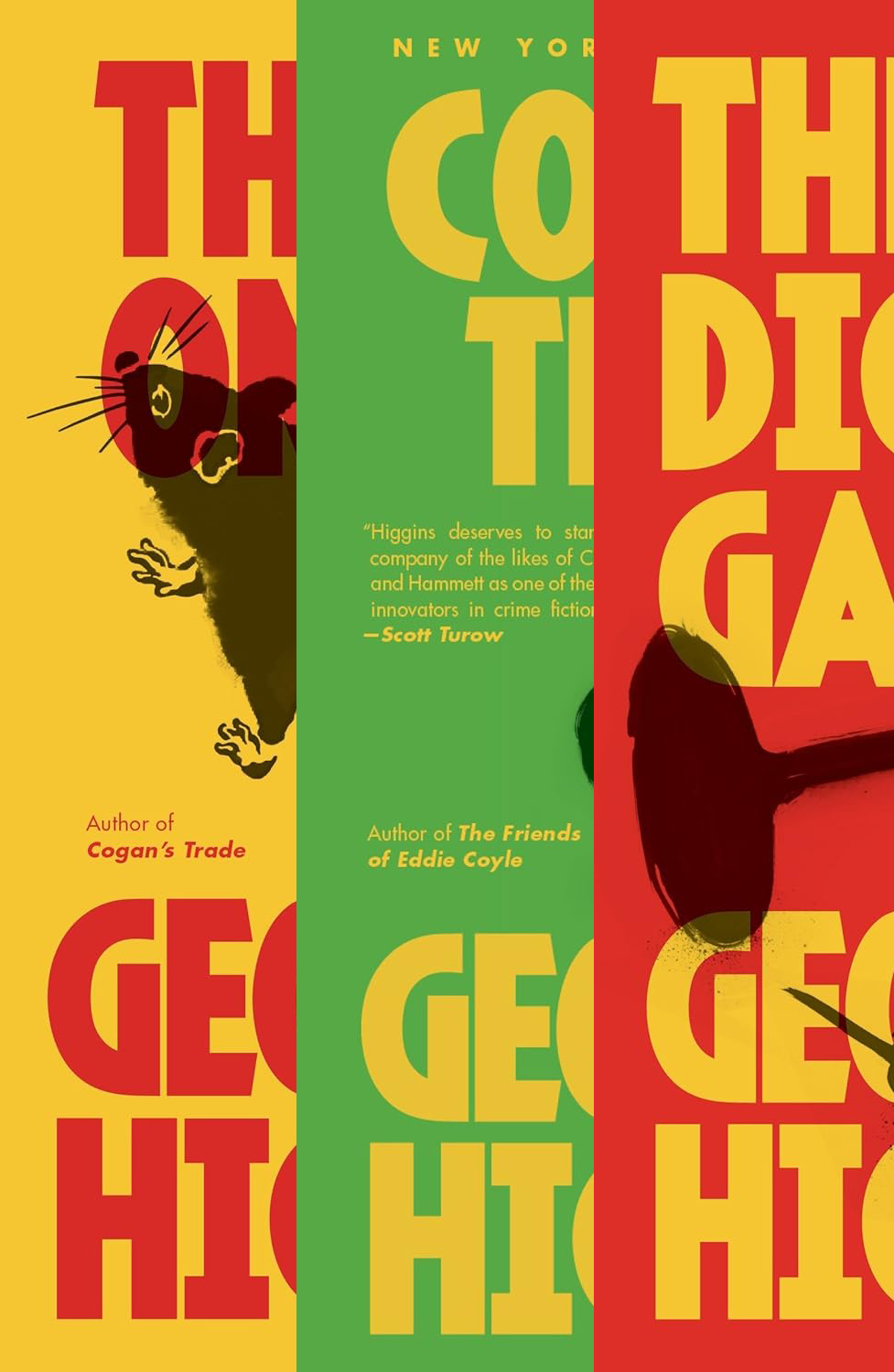
George V. Higgins
Jun, 2011
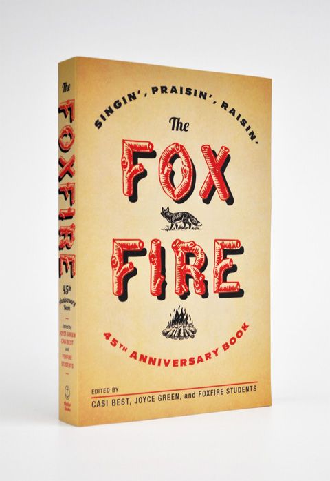
Foxfire
Jun, 2011
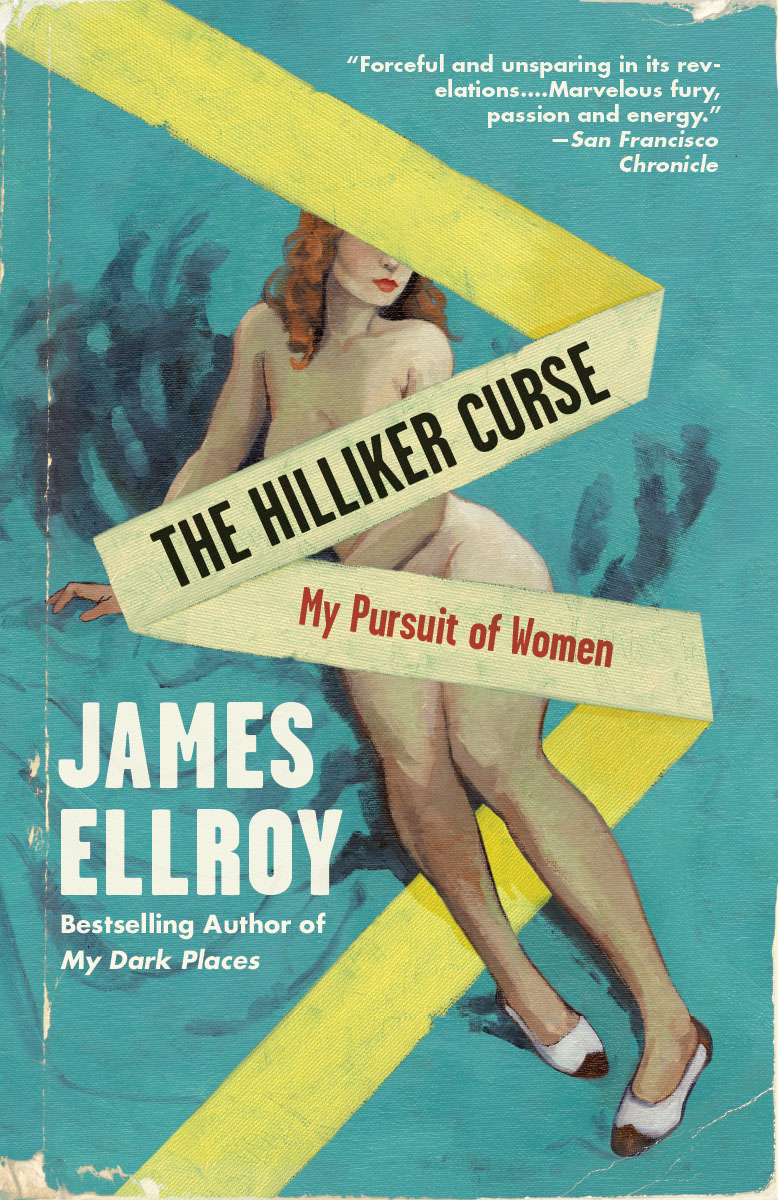
The Hilliker Curse
May, 2011
Cubby’s
Dec, 2011
Villain
Apr, 2011
Loyalty
Apr, 2011
Dogfight
Mar, 2011
50 & 50
Feb, 2011
The Children of Sanchez
Feb, 2011
Mr. Peanut
Nov, 2010
30 Covers, 30 Days
Nov, 2010
You Know Who You Are
Sep, 2010
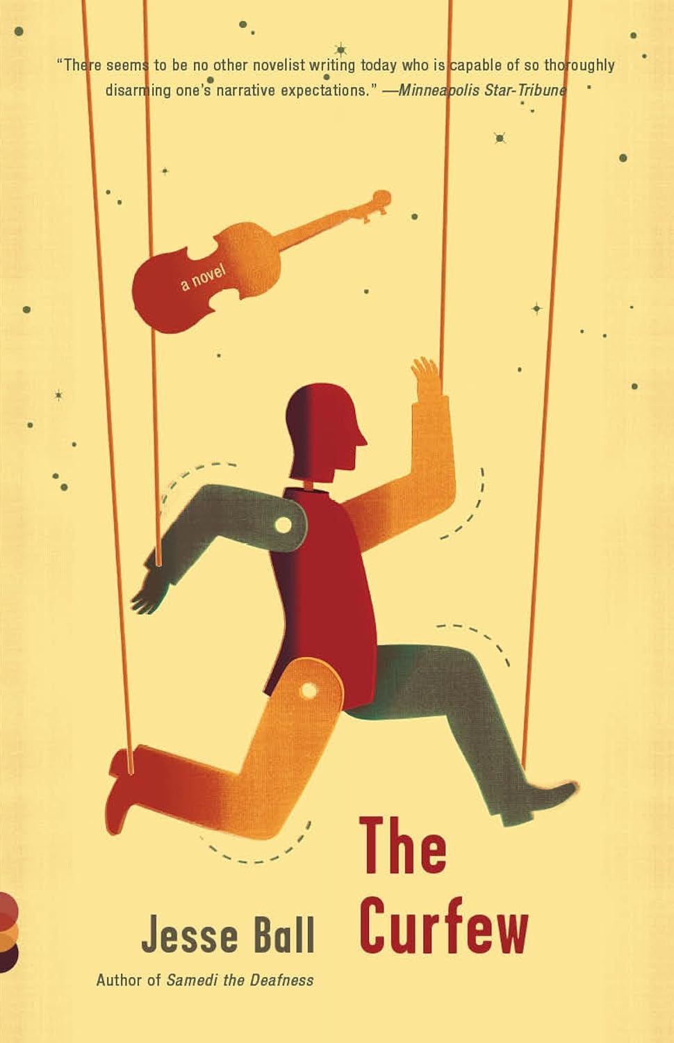
The Curfew
Sep, 2010
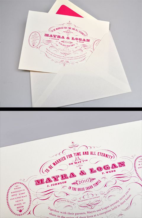
Wedding Invite
May, 2010
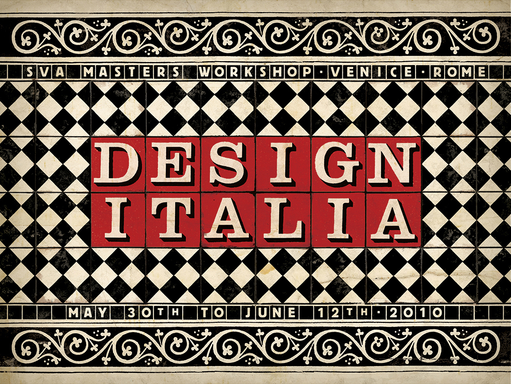
Design Italia
Dec, 2009
Alt
Sep, 2009
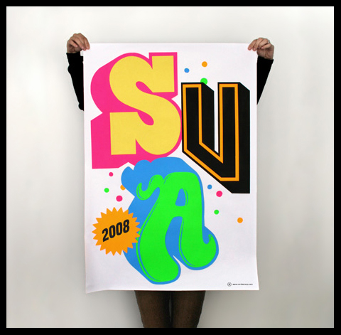
School of Visual Arts
Feb, 2008
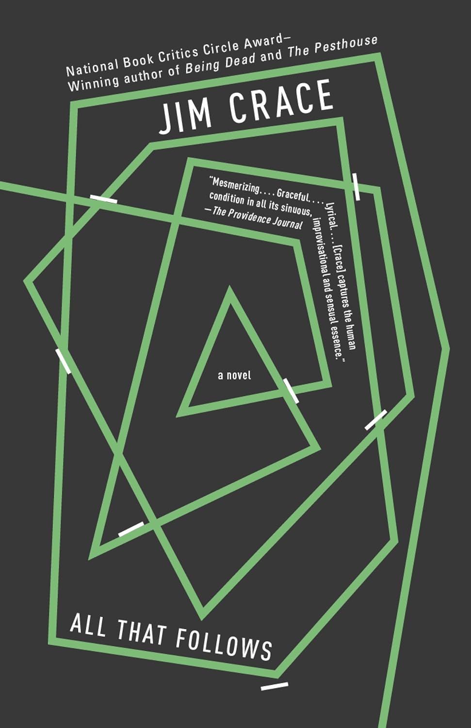
All That Follows
Dec, 2010
Op-Ed Illustration
Nov, 2011
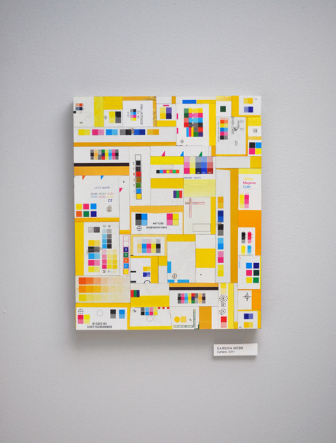
CMYK Collage
Apr, 2012
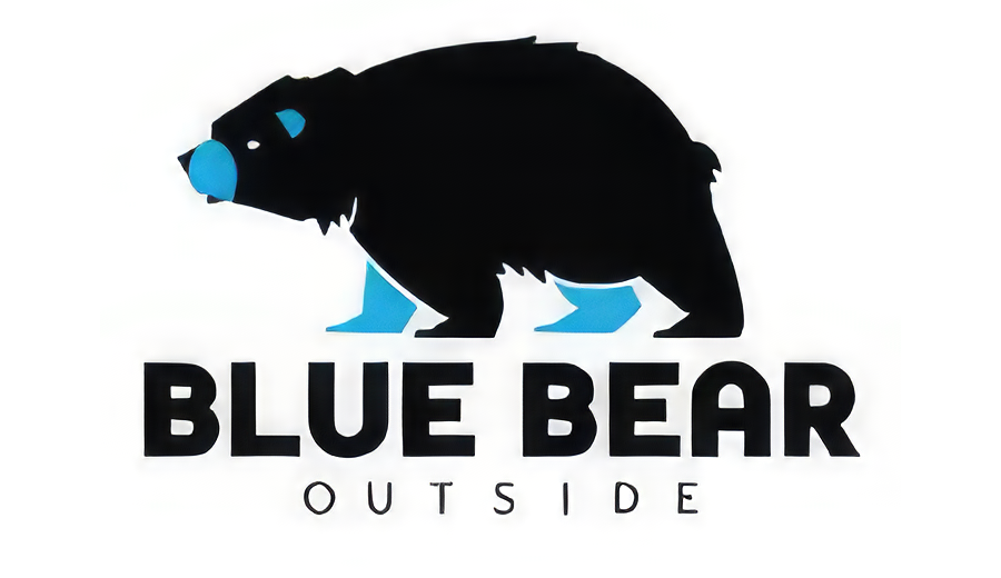
Blue Bear
May, 2012
The Wisdom of Insecurity
Jul, 2010
Ghosts and Lightning
Apr, 2010
You Are Not a Gadget
May, 2010
Future Science
Jan, 2011
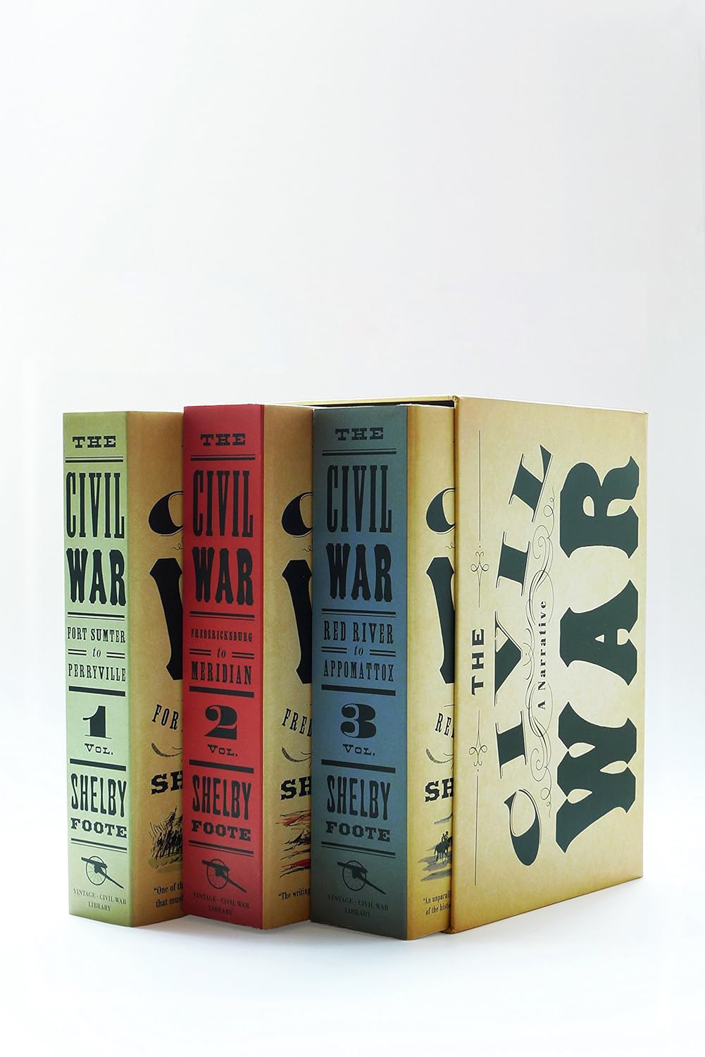
Civil War box set
May, 2010